
.
.
.
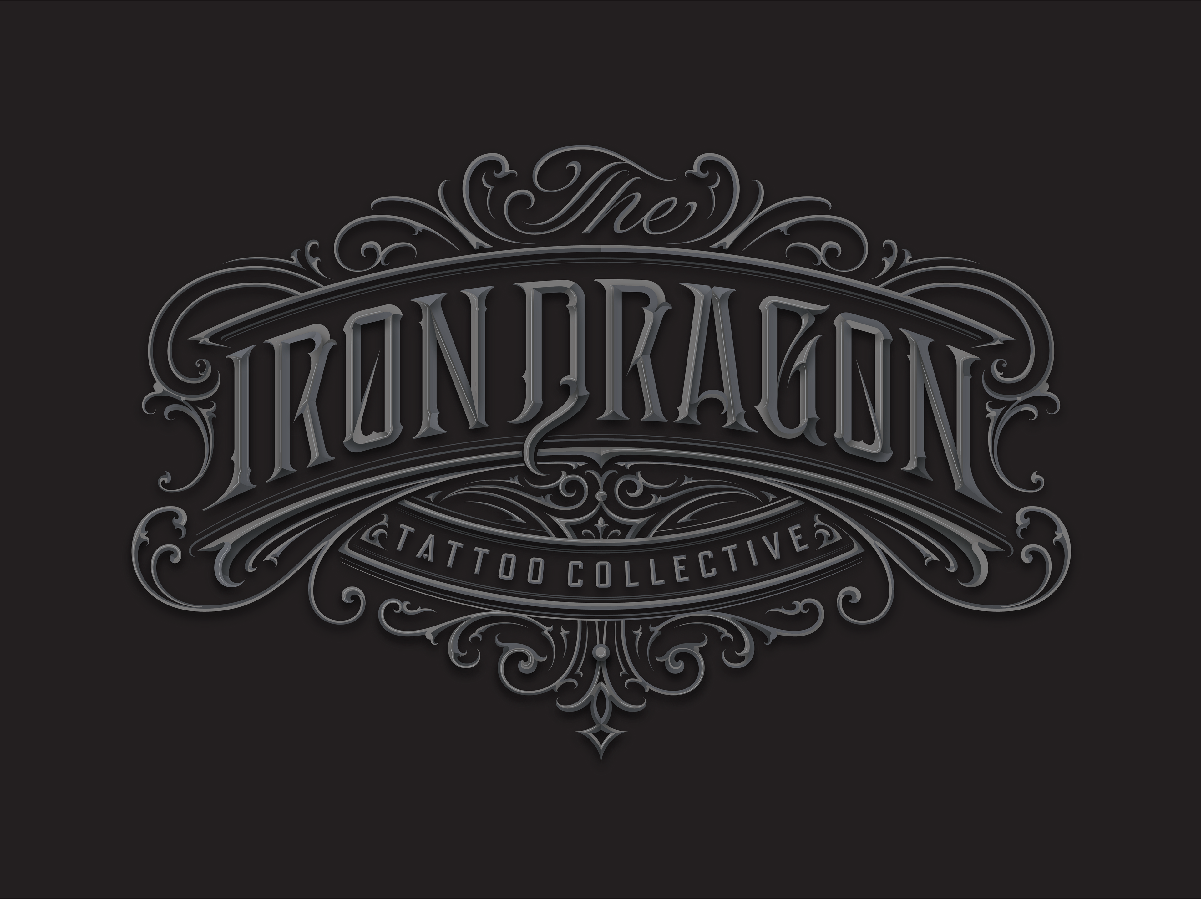
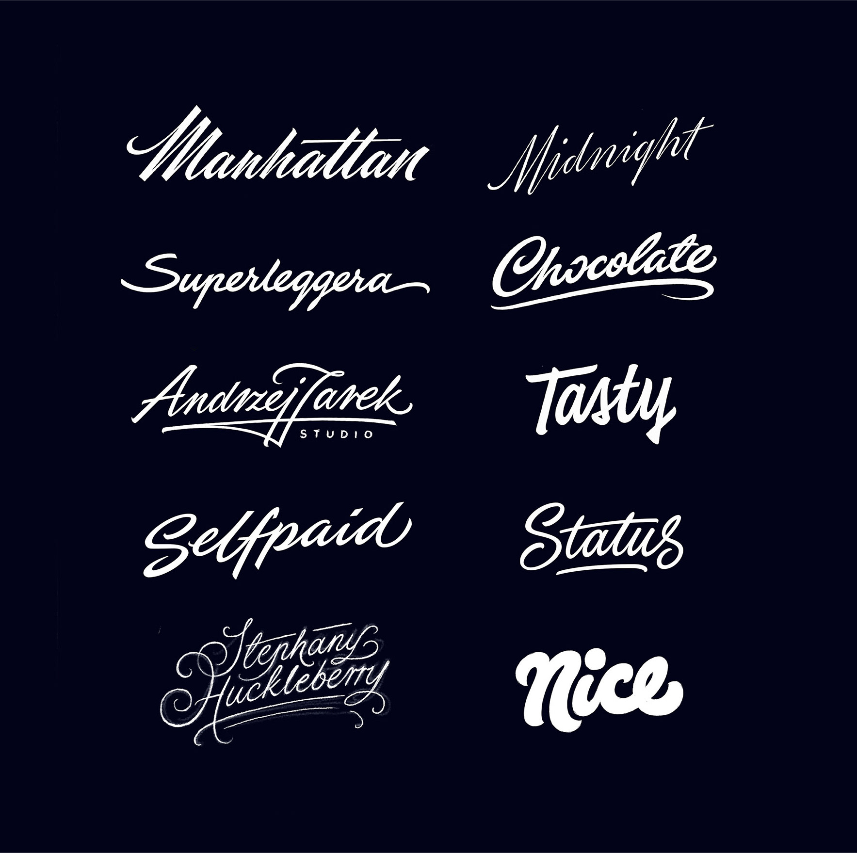
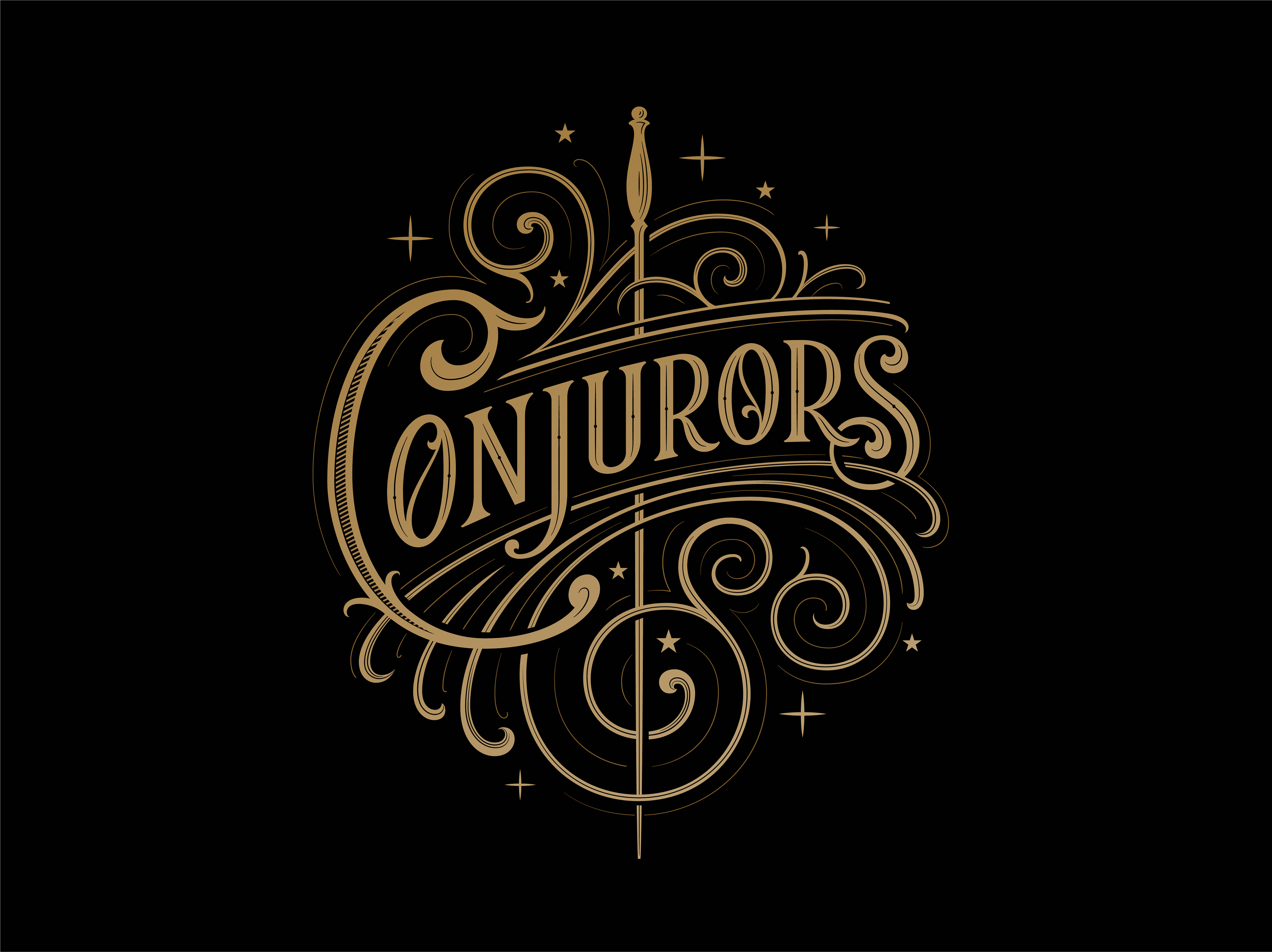
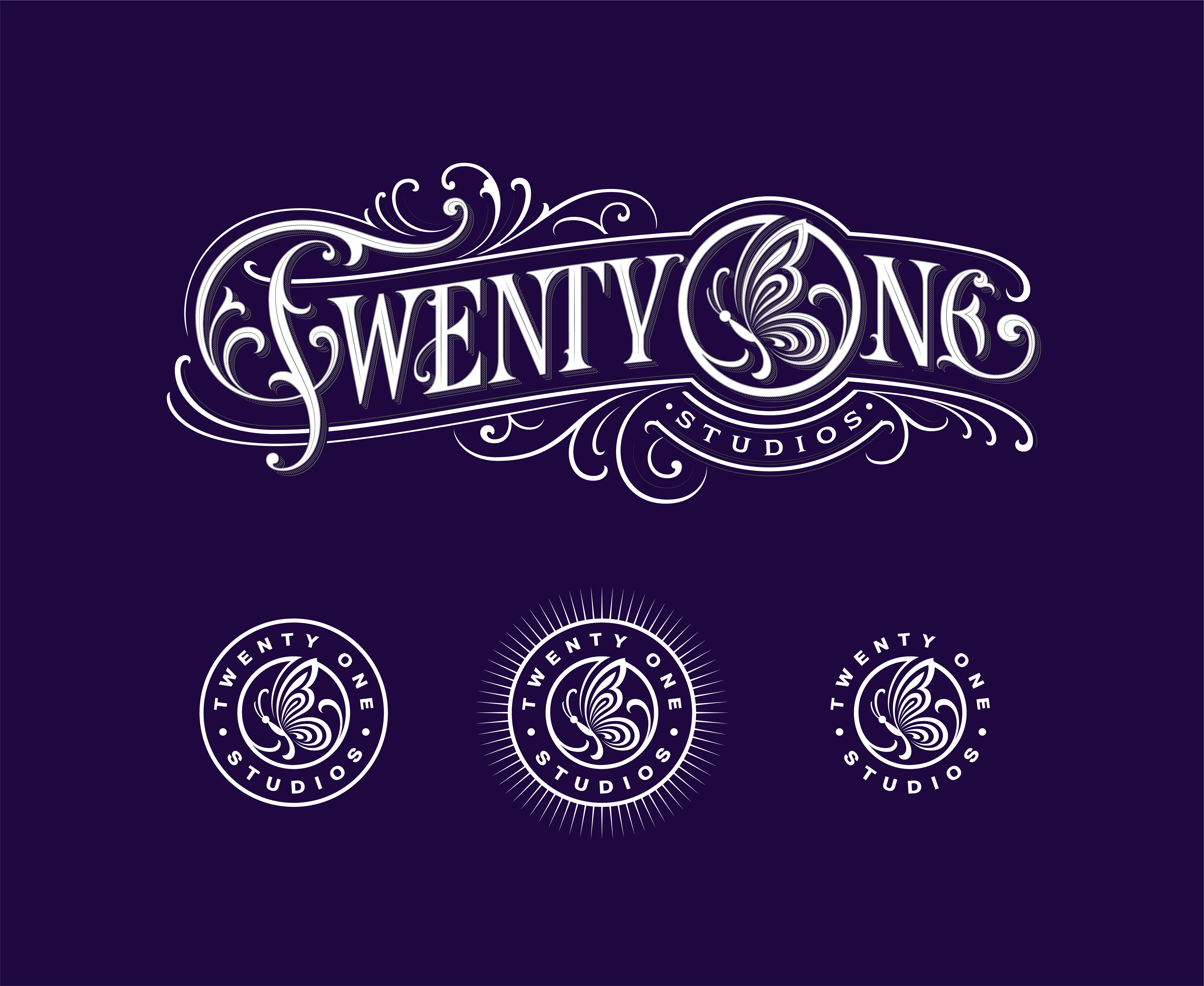
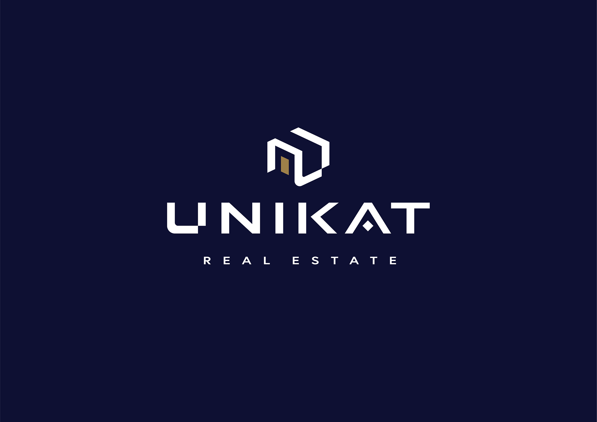
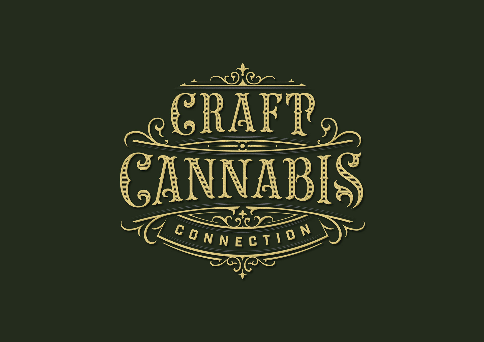
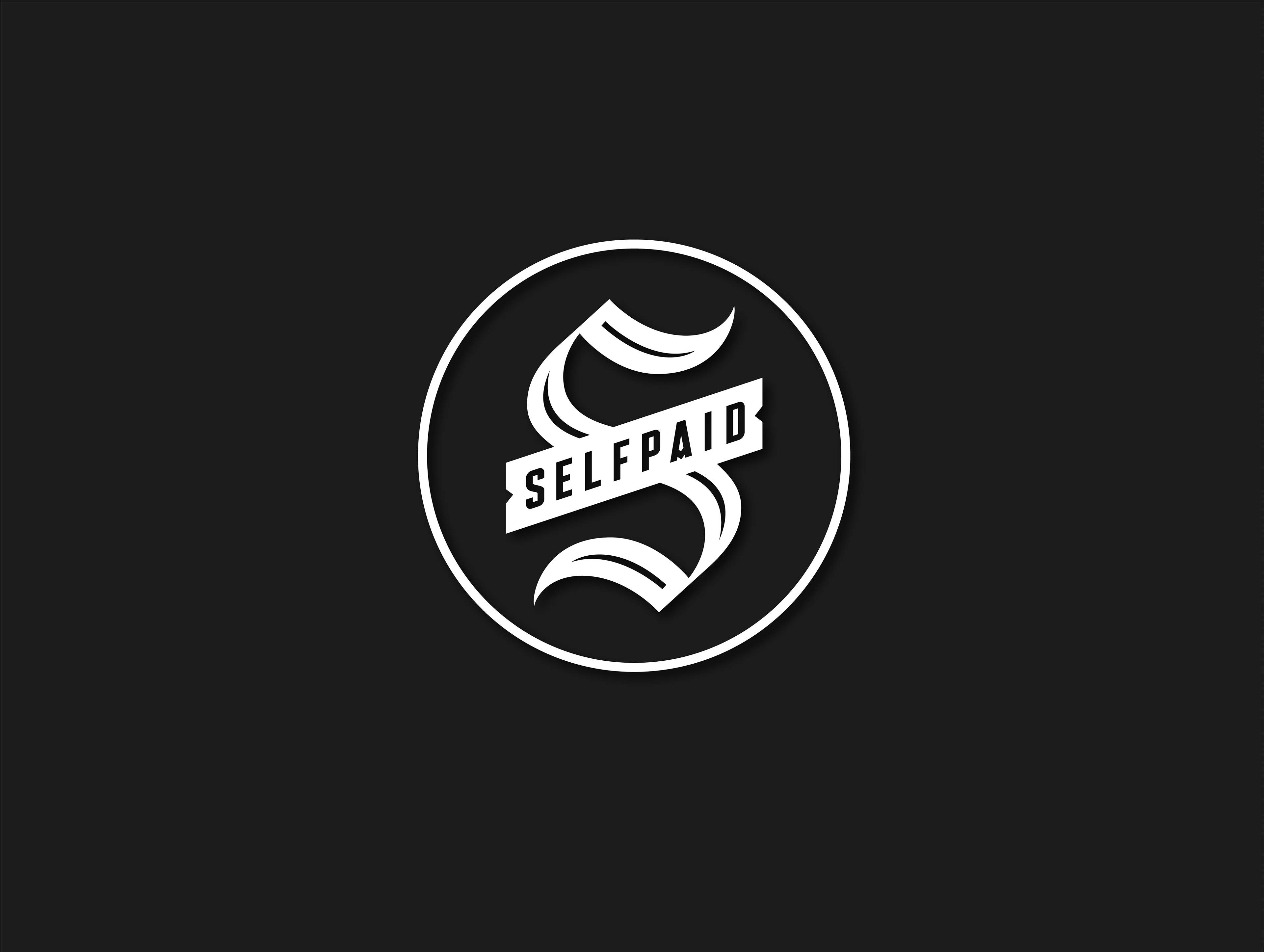
Selected logotypes and lettering works made in 2022.
All the shapes are custom and handmade using pen, pencil, ipad and beziers curves.
Please scroll down where i described my work process.
.
.
.


--- MY WORK PROCESS ---
My work process has evolved over the years.
Nowadays I try to be not only more precise in the technical aspects of the work but also pay more attention to the character of the design which often has to work on very different purposes.
The skill of drawing letters gives me a possibility to work in almost every desired style.
In most cases behind 1 final image is a plenty of work and choices.
.
.
.
-1-
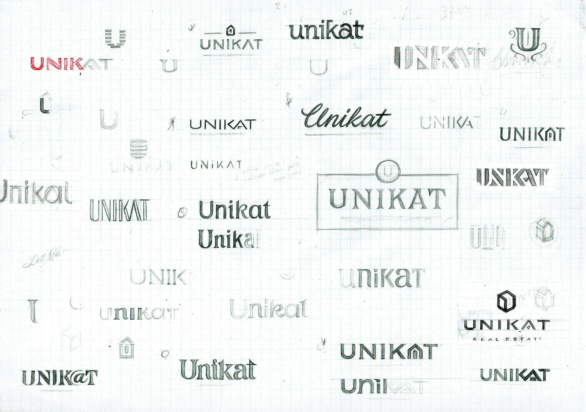
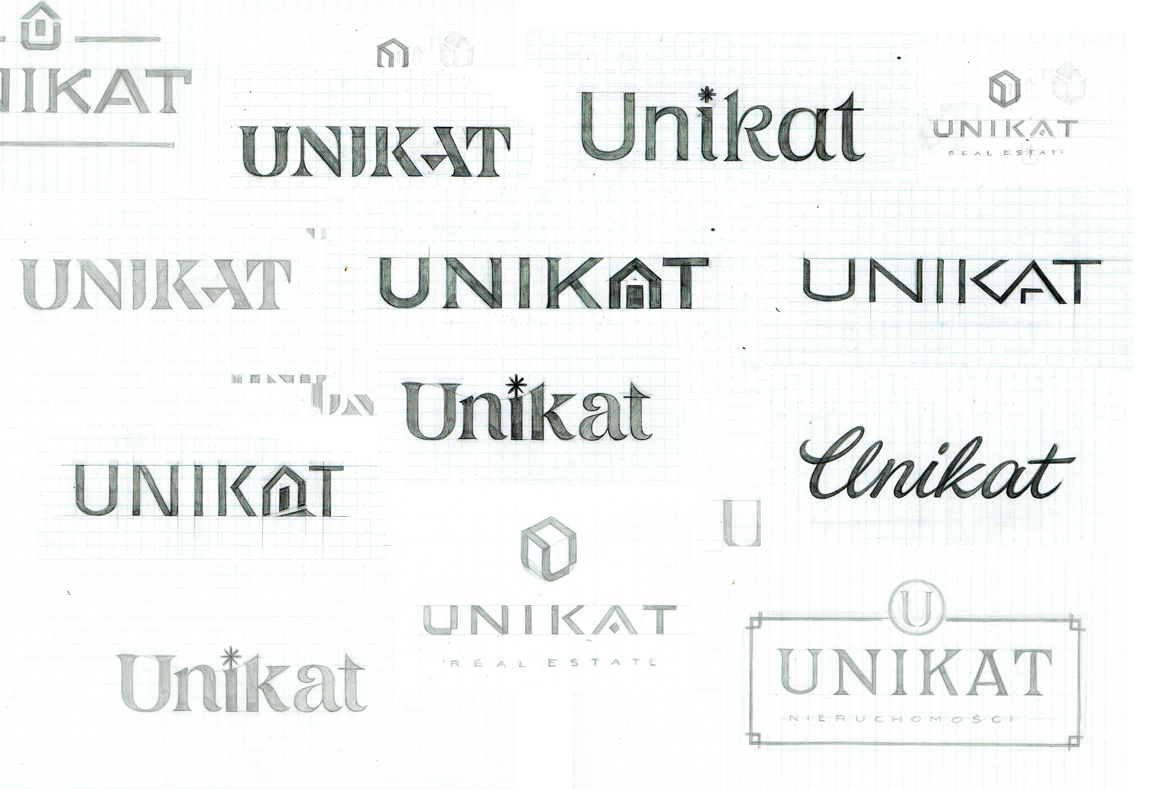
CONCEPT STAGE
No matter how complex and detailed the project is, the work process starts from a series of small sketches.
Based on the brief I search for original but also readable layouts.
With that I can quickly decide whether some idea is worth consideration or not.
Then I go further exploring other ideas I have in my mind.
I need to face very different expectations of the clients.
It takes a completely different creative attitude when I work for the tattoo studio or real estate agency.
From the technical point of view name/text/word is my material to work with.
The number of letters, capital letters, connections between them and some characteristic elements gives me possibilities to show it in an interesting way.
Because of that some words have more artistic potential than others and that's why individual approach to every project is important.
.
.
.
.
.
.
-2-
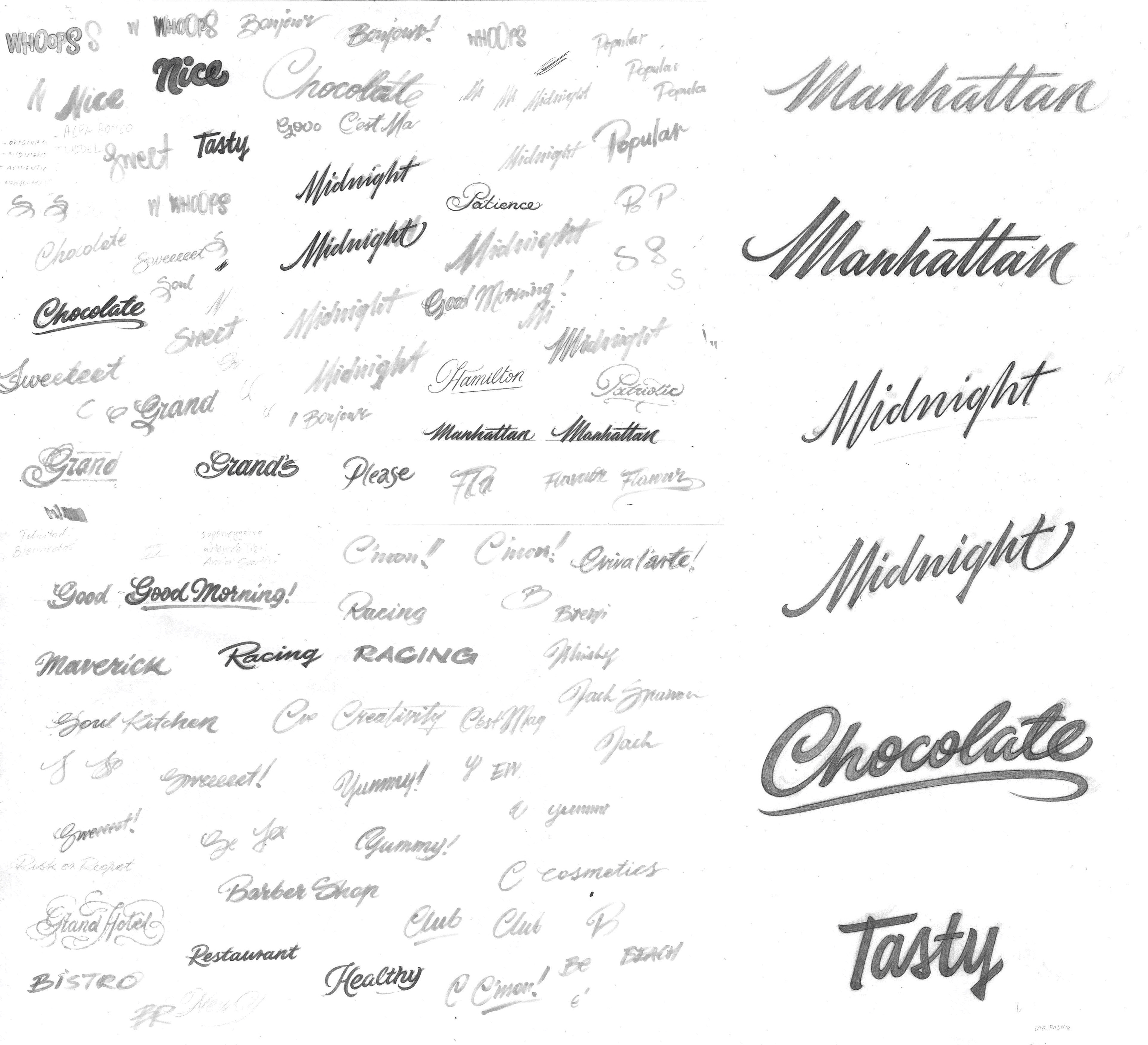
DEVELOPMENT STAGE
In the development stage I redraw the most interesting or chosen options in the bigger scale.
There may be only 1 or many more options.
.
.
.
.
.
.
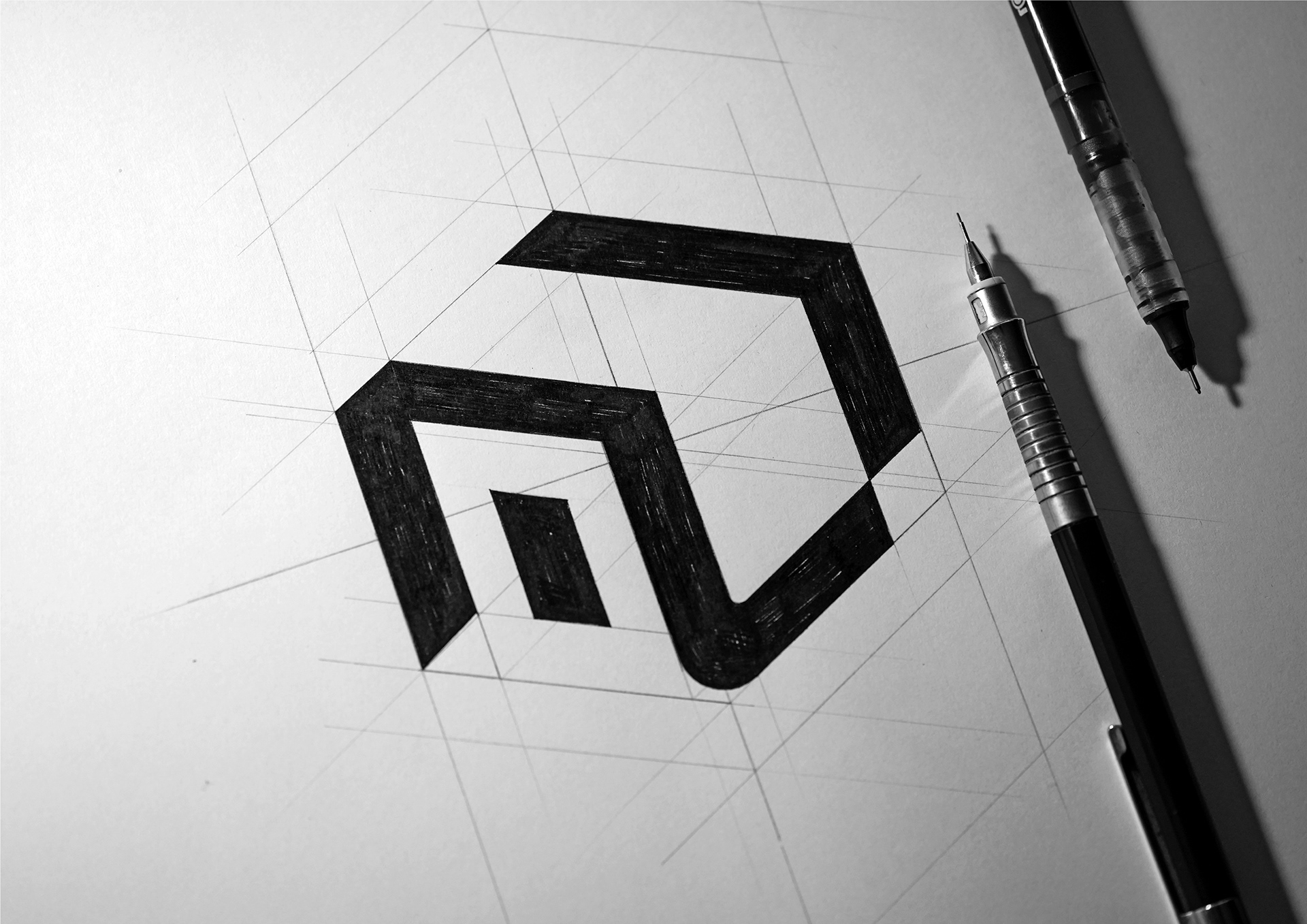
-3-
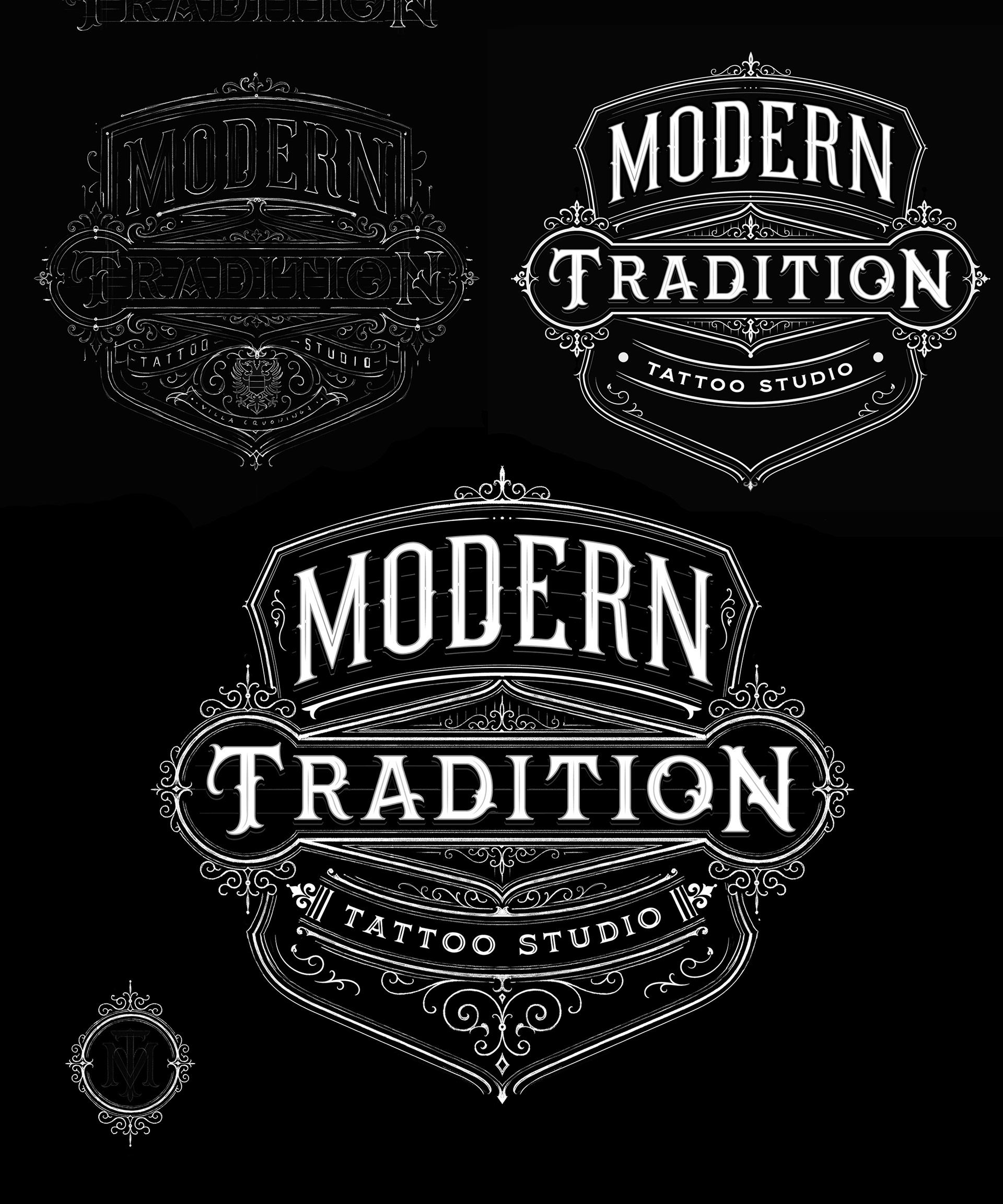
THE FINAL DEVELOPMENT STAGE
The chosen variant is developed on the final sketch.
It may be more or less precise due to the character of the work.
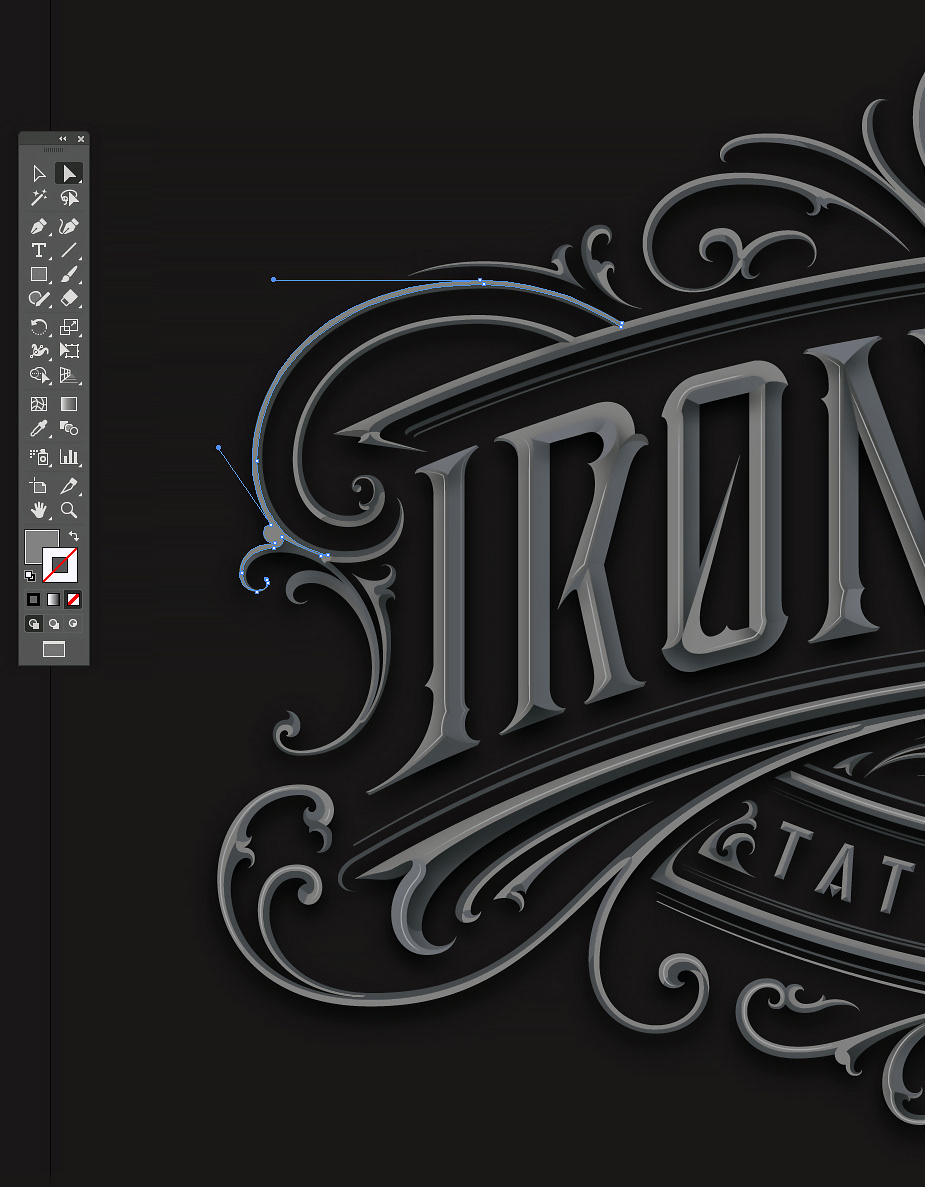
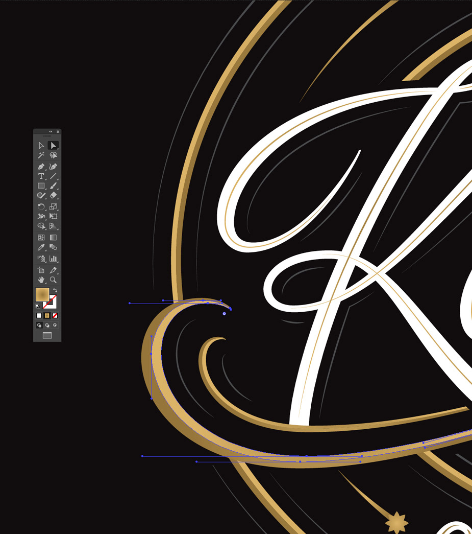
In the end it's going to be a reference layer in Adobe Illustrator.
All the vector shapes are drawn once again with bezier curves and shapes.
The final sketches may be done with ink, pencil or just outlines
The drawings are not 100% accurate and the vector design always needs some corrections in the balance, width and other elements in composition.
The more detailed the work is the more changes between the sketch and final vector design I introduce.
.
.
.


.
.
.
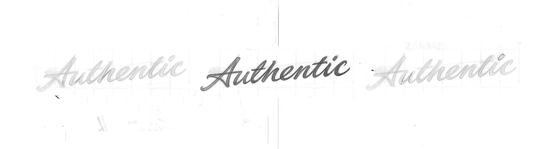
REDRAWINGS AND OTHER AMENDMENTS
No matter the style, I often redraw sketches multiple times at each stage to explore the shapes I like and search for better and better results.
When I believe, that the concept is good but I'm not 100% satisfied with the results, I print it out (or copy it to procreate) and redraw it again. It may also happen when the final vector design is ready.
The new sketch become a new reference layer which will help me to rebuild the existing vector design.
The new sketch become a new reference layer which will help me to rebuild the existing vector design.
Redrawing helps me to bring the project to the next level of finish quality.
.
.
.


The final logos are delivered to the Client in print-ready files to meet the client's expectations.
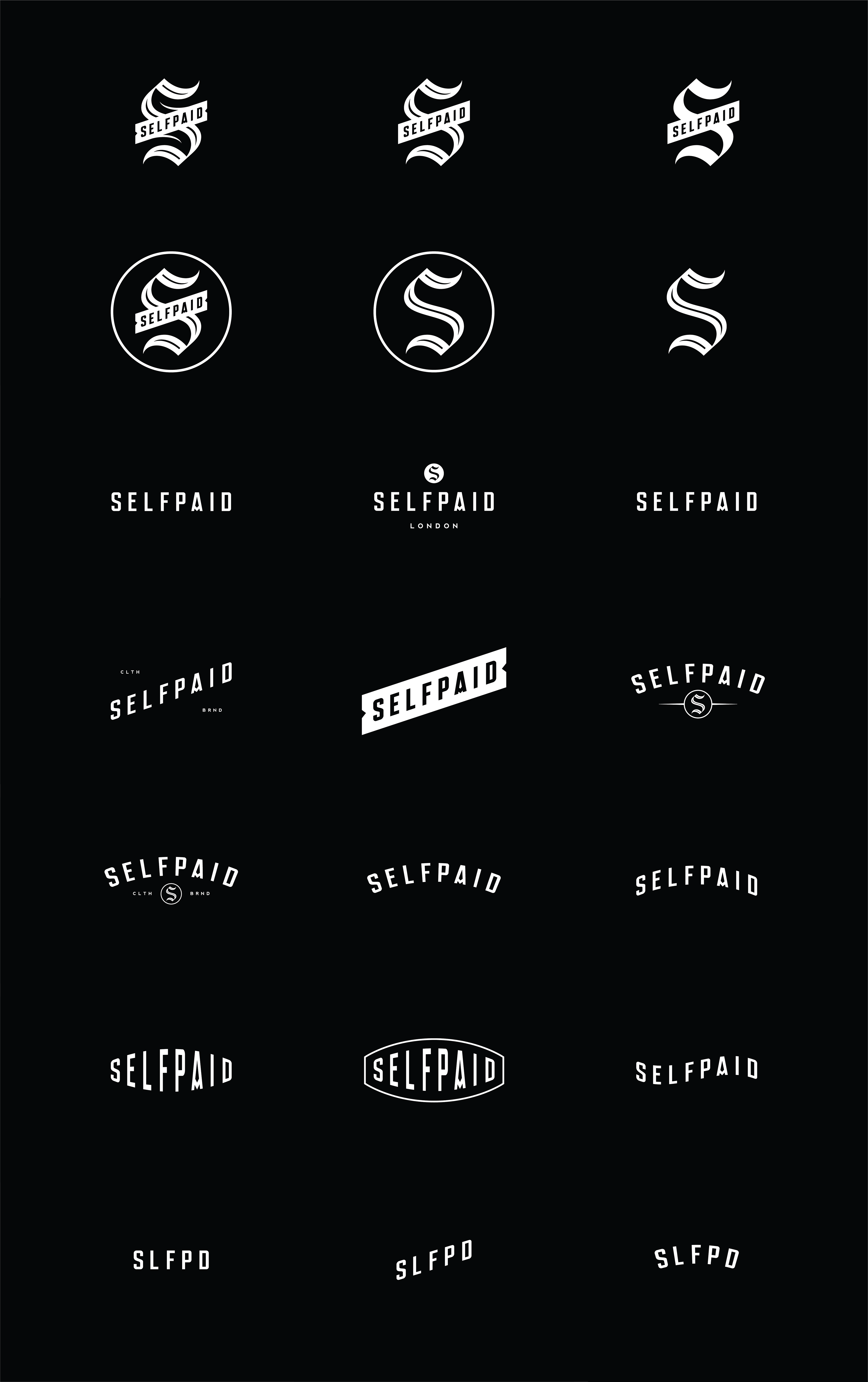
Depending on the possibilities and design aesthetic I always try to deliver as many design options as possible. It includes monograms, alternate logos and simplified variants.

I'll be thankful for every like and comment!
Later this year I'll be focused on showing more artistic and detailed designs because it has always given me the most attention, which is crucial to succeed as a freelance designer.
However, as You can see I am flexible and open to work on every type of interesting project.
If You are interested, please email me:
info@mateuszwitczak.com
mateuszwitczakdesigns@gmial.com